Role: UI/UX Designer
Tools: Figma
Date: June-August 2020
CONNECT2D TELEDENTISTRY
The CONNECT2D TELDENTISTRY app consists of 2 separate user flows of the dentists, and patients. The app’s main service is to seamlessly and efficiently connect dentists, and their patients to have virtual appointments now possible outside of the clinic.
“Our mission is to increase the accessibility and affordability of quality Dental Care by connecting you to Canadian Dentists through video call — so that you can receive help quicker, and feel better faster.”
-CONNECT2D TELEDENTISTRY
Background
This is a project I’ve worked at CONNECT2D TELEDENTISTRY full-time as the sole UI/UX Designer. During the time, I was tasked with 3 main responsibilities:
Prepare and translate the already launched iOS app to Android.
Communicate and present opportunities of UI/UX improvements within the existing iOS build.
Improve the usability based on the user testing and feedback relayed from the stakeholders.
During the time of this project, I was directly communicating with the development, and executive team members to clearly iterate where design could be improved not only visually, but also as an experience to enhance the existing app. For this portfolio showcase, I will highlight and brief a few specific areas within the app where I had played a key role as the Designer.
Initial Thoughts
User Type: Dentists
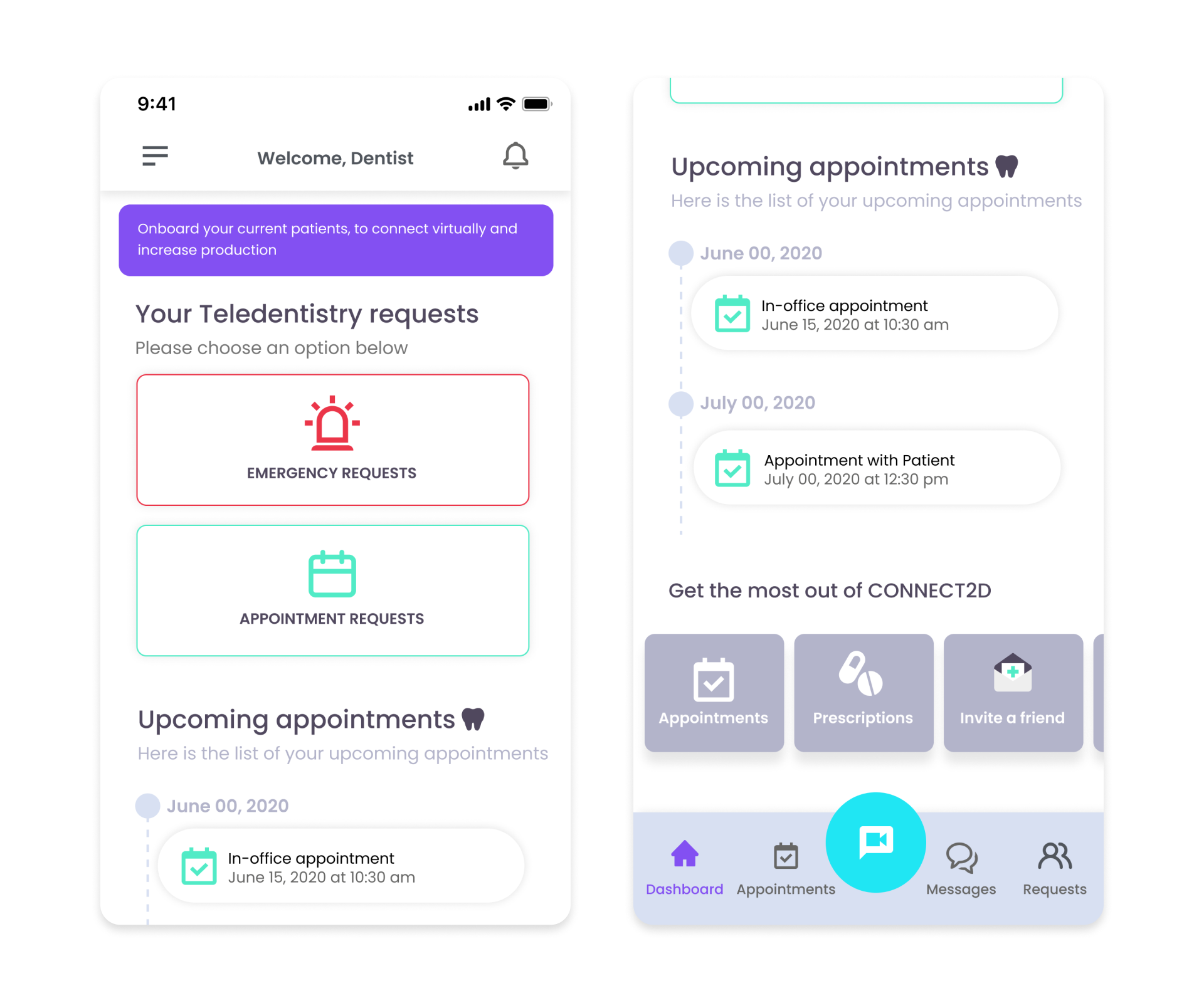
“Emergency Request” as the first thing we see from the dashboard and want users to be using feels too alarming due the use of copy and red colors.
The design is inconsistent; spacing is off, too many variety in text styles, brand color use could be improved and used more purposefully.
“Get the most out of CONNECT2D” need to review value of Appointments, Prescriptions, Invite a friend, and a hidden Get Support card from this carousel.
Interview Highlights
User Type: Patients
“Well I’ll only use the Emergency Request because I can speak to a dentist immediately.”
“Is there a way I can talk to a dentist today even if it is not an emergency?
“When I first opened the app, I didn’t know what the difference between “Emergency Requests, and Appointment Requests was.”
In addition to various other comments from patients, overall the patient users found booking an appointment to be the most confusing.
Dashboard Redesign (Dentist)
1. Spacing and Sizing
Adjusting spacing and keep a more consistent use of limited font styles.
2. Priority Tasks
As the dentist, the previous design has been intended to accommodate for 2 main flows from the dashboard; to view Tele-dentistry call requests from patients, and to view Tele-dentistry calls appointment requests for a later time. In addition to the existing 2 flows, and additional option for dentist’s to directly view in-office appointments have been added.
The wording of each button has been updated to accommodate the ‘in-office’ scheduled appointments, and removed the use of red colors in the case of this UI.
During user interviews, we have noticed many patients have been requesting an “emergency request”, just to immediately see a dentist. Our users had been more comfortable in seeing a dentist as an ‘urgent’ request instead of an ‘emergency’.
3. Organization
Adjust design to fit inactive states when the user do not have an upcoming appointments.
Keep only a single most recent appointment block to limit the dashboard from becoming an extended page.
4. Visibility
Removed the carousel view, and make all 4 “Get the most out of…” options visible.
Adjust the design to match the overall brand and style.
Appointment Queue (Patient)
1. User Awareness
Added an estimated timer as the main focus to this page, so that the user is aware of their estimated wait time, and their position in the queue.
Clearer messaging to notify the users that it is safe to return to the dashboard.
Increased button size, visibility, and updated the description.
2. Updated State
Updated dashboard state. Clearly indicate that the user is currently in queue for a tele-dentistry meeting, and that they are now unable to book another meeting.
Referral Page (Patient)
1. Maintain Design Consistency
Removed the ‘notification’ like design state, and changed to a more standard page with a clearer message.
Added a selection for users to view their current balance of referral credits.
The overall page design is much more visual, and aligns with the brand’s design system.
2. Improve Navigation and Visibility
Removed the share buttons of each social media outlet, and replaced it with a single button that opens the built-in iOS share extension.


